12. Data Visualisation#
Data visualisations such as graphs and diagrams often make it easier for researchers to explore patterns and trends within large data sets, or to identify notable exceptions to the trends that can be observed.
During the last number of years, a large number of visualisation libraries have been developed for the Python language. Examples include Bokeh, Plotly, Altair and Folium.
One of the earliest visualisation libraries in Python is called matplotlib. This library is very powerful, but its code can easily get quite complicated and wieldy. The visualisation library seaborn can be viewed as as extention and a simplification of matplotlib. According to its documentation, seaborn “provides a high-level interface for drawing attractive and informative statistical graphics”. You can use seaborn to create fairly complicated visualisations using a limited number of functions, and, fortunately, much of the processing takes place behind the scenes. A second important advantage of seaborn is that it works well in combination with pandas, a Python library for data analysis.
This tutorial also explains a number of visualisations that can be created using seaborn and matplotlib.
The data to be visualised#
Data visualisations are obviously based on data. This tutorial makes use of a dataset named ‘bli.csv’. This file contains data collected for the 2018 Better Life Index, which was created by the OECD to visuale some of the key factors that contribute to well-being in OECD countries, including education, income, housing and environment. The data set is included in the ‘Data’ folder created for this tutorial. If you cannot locate this dataset, you can also download it from the following address: https://edu.nl/bcm4x
import pandas as pd
import os

path_to_csv = os.path.join('Data','bli.csv')
df = pd.read_csv(path_to_csv)
Importing seaborn and matplotlib#
Before you can work with seaborn, you need to import this package. It is customary to import seaborn under the alias ‘sns’.
We also need to import matplotlib’s pyplot module. The code below uses the alias ‘plt’. The pyplot module can be used to customise seaborn plots. The pyplot module can be used to change the nature and the appearance of plots.
import seaborn as sns
import matplotlib.pyplot as plt
A bar plot#
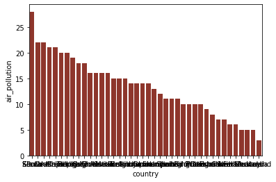
Bar plots can be created using the barplot() method. It demands a data parameter, which need to refer to a pandas dataframe containing the values you want to visualise.
Additionally, we need supply two variables: (1) the values to be shown on the X-axis and (2) the values to be shown on the Y-axis. These values need to be passed as the x and the y parameters, respectively. The y parameter, more concretely, specifies the height of the bars that are drawn. Optionally, you can also use the color parameter to specify a fixed fill colour for the bars in the plot. This parameter need to be assigned a hexadecimal code for colours. To find such hexadecimal codes, you can make use of a colour picker tool.
The code below visualises the level of air pollution in the various countries described in the BLI dataset. Note that the code also sorts the values found for the variable ‘air_pollution’ in a descending order, using the pandas method sort_values(). As a result of this, the values will be shown in a specific order: from highest to lowest.
import pandas as pd
import matplotlib.pyplot as plt
import seaborn as sns

x_axis = 'country'
y_axis = 'air_pollution'

df_sorted = df.sort_values(by=[ y_axis] , ascending = False)

sns.barplot( data= df_sorted , x=x_axis, y= y_axis, color = '#9e291c'  )

plt.show()
Customisations#
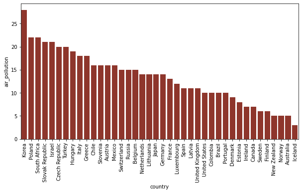
Clearly, the appearance of the barplot can still be improved in a number of ways. One difficulty is that the label on the X-axis cannot be read, because of the fact that they overlap. We may also want to increase the size of the plot, to enhance the readability. Customisations such as these can be done via matplotlib methods.
The figure() method, firstly, has a figsize parameter, which can be assigned a tuple with two integer values. The first of these specifies the width, and the second integer specifies the height.
As values for the figsize parameter, you can specify the width and the height of the graph in inches.
We can solve the issue with the overlapping labels on the X-axis by rotating them. The orientation of these labels can be changed using the xticks() method from matplotlib.
import pandas as pd
import matplotlib.pyplot as plt
import seaborn as sns

x_axis = 'country'
y_axis = 'air_pollution'

fig = plt.figure( figsize=( 10 , 5 ) )

sns.barplot( data= df_sorted , x=x_axis, y= y_axis, color = '#9e291c'  )

plt.xticks(rotation= 90)


plt.show()
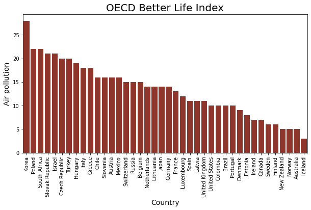
It is good practice, furthermore, to annotate the plot to make it easier for viewers to understand what the visualisation actually shows. To do this, you can work with a number of seaborn methods.
By default, seaborn prints the names of the columns that are visualised along the X-axis and the Y-axis. If you want to show different labels, you can provide these via the set_xlabel() and set_ylabel() methods. The string to be displayed needs to be used as a first parameter. Optionally, you can supply a size parameter to change the font size. set_title() can be used to add a main title above the plot.
Note that these seaborn functions need to be applied to the grapg that is created by the barplot() method. To be able to this, this result of barplot() needs to be assigned to a variable. In the example below, the result is assigned to a variable named graph. The methods to add the labels and the title can then be applied to this graph variable.
To make sure that the graph is rendeded properly, it is advisable to end the code with the command plt.show().
import pandas as pd
import matplotlib.pyplot as plt
import seaborn as sns

x_axis = 'country'
y_axis = 'air_pollution'

fig = plt.figure( figsize=( 10 , 5 ) )

df_sorted = df.sort_values(by=[ y_axis] , ascending = False)

graph = sns.barplot( data= df_sorted , x=x_axis, y= y_axis, color = '#9e291c'  )

graph.set_title('OECD Better Life Index' , size = 20)
graph.set_xlabel('Country' , size = 14)
graph.set_ylabel('Air pollution' , size = 14 )

plt.xticks(rotation= 90)

plt.show()
Exercise 12.1#
PISA is the OECD’s Programme for International Student Assessment. This programme evaluates educational systems globally by measuring the performance of 15 year-old-children in mathematics, science and reading. The latest study is from 2018.
The data folder of this tutorial includes a CSV file named ‘pisa.csv’. It contains all the scores measured for mathematics and reading in between 2000 and 2018.
How did the various countries that were examined in 2018 perform on the reading tests? Which countries had the highest scores, and which countries had the lowest scores? ou can limit the analyses to the the ‘total’ scores (i.e. those records in which column ‘object’ has value ‘TOT’).
Using Pandas, Matplotlib and Seaborn to create a bar plot which can help to answer this question.
Create a figure with a size of 10x5
Rotate the x-tick labels by 90 degrees
Use the colour ‘#910c26’’ for all the bars.
path_to_csv = os.path.join('Data','pisa.csv')
df = pd.read_csv(path_to_csv)

## All scores received for reading in 2018
df_2018 = df[ (df['subject'] == 'TOT') & (df['year'] == 2018)  ]
df_2018 = df_2018.sort_values(by=[ 'pisa_read'] , ascending = False)
Changing the plot style#
The overall style of the plot, including the background colour and the presence of the of grid lines, can be modified using set_style().
The following styles have been defined in seaborn:
darkgrid
whitegrid
dark
white
ticks
sns.set_style("darkgrid")
Categorical variables#
Categorical variables are variables which can be used to divide observations into smaller groups. They can divide the observations in the dataset over a number of categories. The values for such categorical variables are usually taken from a limited set of options. These options are often strings, such as ‘low’, ‘medium’ or ‘high’.
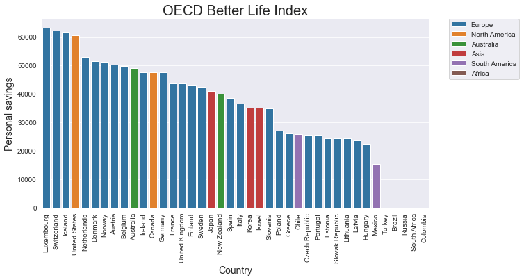
In a seaborn barplot, you can easily visualise the different categories that are available via the fill colour of the bars. In the barplot() method, you can work with a parameter named hue. When you mention the name of a categorirical variable as a value for this hue parameter, the different groups that can be created will all be shown in a different colour. In addition, a legend will be added to clarify the meaning of these colours.
To avoid overlapping bars, you need to set the value of the dodge parameter to ‘False’.
If the code still includes a color paramater, the plot will clarify the different groups using shades of this specific colour. If hue is used without the color parameter, and without the palette parameter that is discussed below, seaborn will select the colours for the different groups automatically.
path_to_csv = os.path.join('Data','bli.csv')
df = pd.read_csv(path_to_csv)
import pandas as pd
import matplotlib.pyplot as plt
import seaborn as sns
x_axis = 'country'
y_axis = 'personal_earnings'
hue = 'continent'
fig = plt.figure( figsize=( 10 , 5 ) )
df_sorted = df.sort_values(by=[ y_axis] , ascending = False)
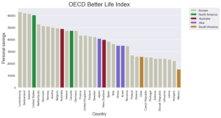
graph = sns.barplot( data=df_sorted , x=x_axis, y=y_axis, hue=hue , dodge=False )
graph.set_title('OECD Better Life Index' , size = 20)
graph.set_xlabel('Country' , size = 14)
graph.set_ylabel('Personal savings' , size = 14 )
plt.xticks(rotation= 90)
# The next line places the legend outside out the plot
plt.legend( bbox_to_anchor=(1.05, 1),loc=2, borderaxespad=0.);
plt.show()
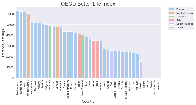
If you don’t particularly like the colour that seaborn has chosen, it is good to know that it is also possible to select the colours yourself. As a first step, you can create a list of the colours you want to work with.
colours = [ '#c7c4af' , '#0e9e30', '#a0061a' , '#6a55d4' , '#cf8817' ]
When you do this, you need to make sure that the number of colours in this list is equal to or greater than the number of categories in the categorical value you work with. In our current example, the colours are determined by the values in the ‘continent’ column. The dataset has information about countries on five continents, so we need to make sure that the list named colours has at least five items. Once we have created the list of colours, we can use this list as a value for the palette parameter.
import pandas as pd
import matplotlib.pyplot as plt
import seaborn as sns

x_axis = 'country'
y_axis = 'personal_earnings'
hue = 'continent'

fig = plt.figure( figsize=( 10 , 5 ) )

colours = [ '#c7c4af' , '#0e9e30', '#a0061a' , '#6a55d4' , '#cf8817'  ]


df_sorted = df.sort_values(by=[ y_axis] , ascending = False)
df_sorted = df_sorted.dropna(subset = [x_axis, y_axis])


graph = sns.barplot( data= df_sorted ,
                        x=x_axis,
                        y= y_axis,
                        hue = hue ,
                        dodge = False ,
                        palette = colours )

graph.set_title('OECD Better Life Index' , size = 20)
graph.set_xlabel('Country' , size = 14)
graph.set_ylabel('Personal savings' , size = 14 )

plt.xticks(rotation= 90)
# The next line places the legend outside out the plot
plt.legend( bbox_to_anchor=(1.05, 1),loc=2, borderaxespad=0.);


plt.show()
Colour palettes#
Next to specifying all the colours yourself, you can also make use of one of seaborn’s predefined colour pallettes. You can choose from several tens of predefined palettes. The list below only mentions some of the possibilities.
hls
Blues
Reds
Greens
crest
PiYG
BuGn
GnBu
OrRd
YlOrRd
pastel
colorblind
dark
Paired
flare
husl
Set1
Set2
Set3
Be aware that the names of these palletes are case-sensitive. The names of these palettes can be used in the color_palette() method.
sns.color_palette("PiYG")
The pallette returns a set of six colour by default. If you need less or more numbers, you can specify an integer to indicate the needed number of colours as a second parameter.
sns.color_palette("Paired",10 )
Such palettes can also be applied usefully in seaborn visualisations. To find out how many colours we need for a specific column, we can work with the unique() method from pandas.
hue = 'continent'
nr_categories = df[hue].unique().shape[0]
This number can then be used as the second parameter in the color_palette() method. Once we have such a list of numbers, this list can be used in the palette attribute of the plotting function.
import pandas as pd
import matplotlib.pyplot as plt
import seaborn as sns

x_axis = 'country'
y_axis = 'personal_earnings'
hue = 'continent'

fig = plt.figure( figsize=( 10 , 5 ) )

nr_categories = df[hue].unique().shape[0]
colours = sns.color_palette('pastel' , nr_categories )

df_sorted = df.sort_values(by=[ y_axis] , ascending = False)

graph = sns.barplot( data= df_sorted ,
                        x=x_axis,
                        y= y_axis,
                        hue = hue ,
                        dodge = False ,
                        palette = colours )

graph.set_title('OECD Better Life Index' , size = 20)
graph.set_xlabel('Country' , size = 14)
graph.set_ylabel('Personal savings' , size = 14 )

plt.xticks(rotation= 90)
# The next line places the legend outside out the plot
plt.legend( bbox_to_anchor=(1.05, 1),loc=2, borderaxespad=0.);


plt.show()
Exercise 12.2.#
As for exercise 12.1, make a bar chart which gives information about the total scors for reading in 2018. For this exercise, try to give information about the continents as well. Use distinctive colours for each continent.
A scatter plot#
A scatter plot is a data visualisation that makes use of dots to represent the values of two numerical variables. Scatter plots can be created using the scatterplot() method. The parameters for this method are largely the same as those for barplot(). The data parameter needs to refer to a pandas dataframe containing the dataset you want to visualise. The parameters x and y specify the variables (i.e. the columns) from this dataset that you want to display on the X-axis and the Y-axis, respectively.
You can specify a fixed colour for the points using the color parameter, and the size of the points can be set using the s parameter.
As is the case for the barplot, you can change the size of the figure via the figure() method from matplotlib’s pyplot module.
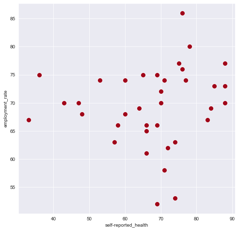
fig = plt.figure( figsize = ( 8,8 ))

x_axis = 'self-reported_health'
y_axis =  'employment_rate'

ax = sns.scatterplot( data = df , x = x_axis , y = y_axis , color = '#a0061a' , s = 100 )

plt.show()
Exercise 12.3.#
In the PISA data set, how do the scores for reading compare to the scores for mathematics?
Focus on the scores obtained in 2018. Answer this question by creating a scatter plot.
Customise the plot according to the following specifications:
Plot size: 10 x 6
Sizes of markers/dots: 100
Colour of the markers: ‘#119c2a’
Annotating text annotation on a scatterplot#
In the scatterplot above, it is clearly difficult to understand what the various dots mean. Which countries are actually shown on this plot? Once you have created the scatterplot, you can use the text() method from pyplot to add descriptive labels to the points.
You need to provide values for the following parameters:
x: the position of the label on the X-axisy: the position of the label on the Y-axiss: the text to be displayed.
The text() function adds one label at a time. If your data is in a pandas dataframe, you can work with iterrows() to navigate across all the rows in the dataframe.
You can also work with a number of additional parameters to manipulate the typography of the labels.
color: font colour of the labelweight: ‘bold’ or ‘semibold’fontsize: a floating point number to specify the size of the fontalpha: a floating point number in betgeen 0 and 1, representing the opacity (or transparency).
fig = plt.figure( figsize = ( 8,8 ))

x_axis = 'self-reported_health'
y_axis =  'employment_rate'

df = df.dropna(subset = [x_axis, y_axis])
ax = sns.scatterplot( data = df , x = x_axis , y = y_axis , color = '#a0061a' , s = 100 )

for index, row in df.iterrows():
    plt.text( row[x_axis],row[y_axis],row['country'],
             fontsize=12.8,
              weight='semibold')

plt.show()
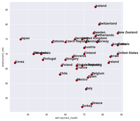
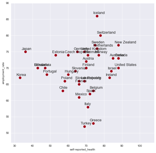
The text() method places the start of the label on the exact same spot as the dots in the scatterplot. For aesthetic reasons, you may want to change the location of the labels just slightly. To change the initial location of the label, you can add or subtract some values to the positions on the X-axis and the Y-axis. Finding the suitable values often demands some trial and error.
seaborn normally infers the limits of the X-axis and the Y-axis from your data. In some cases, however, you may want to adjust the limits of the axes yourself. When you add labels to a scatter plot, some of the text may partly be shown outside of the plot, as you can see in the graph above. In such situations, it can be useful to adjust the range of the values that are shown on the horizontal and the vertical axes.
As is illustrated, you can do this via set(), from seaborn. The xlim and and the ylim parameters for this method both demand a tuple with two values: the lowest value and the highest value. These two numbers determine the range of values that you will see on the X-axis and the Y-axis. As you try to optimise the values for these ranges, it can be helpful to work with the min() and the max() methods, which can be applied to pandas Series. These methods return the highest and the lowest values in a Series containing numerical values.
fig = plt.figure( figsize = ( 9,9 ))

x_axis = 'self-reported_health'
y_axis =  'employment_rate'

df = df.dropna(subset = [x_axis, y_axis])
g = sns.scatterplot( data = df , x = x_axis , y = y_axis , color = '#a0061a' , s = 100 )

g.set(xlim=( df[x_axis].min()-5, df[x_axis].max()+20))
g.set(ylim=( df[y_axis].min()-5, df[y_axis].max()+4 ))

for index, row in df.iterrows():
    plt.text( row[x_axis]-2,row[y_axis]+0.6,row['country'],
             fontsize=12.8 )

plt.show()
Exercise 12.4.#
As for exercise 12.3, create a scatterplot which can help to visualise the correlation between the scores for reading and the scores for mathematics. This time, also add labels to indicate the scores for the countries captured in the list named countries, defined below.
countries = [ 'Netherlands', 'France' , 'Germany' , 'Belgium', 'Luxembourg','Italy']
The font size of the label must be 12.8 and the font weight must be bold.
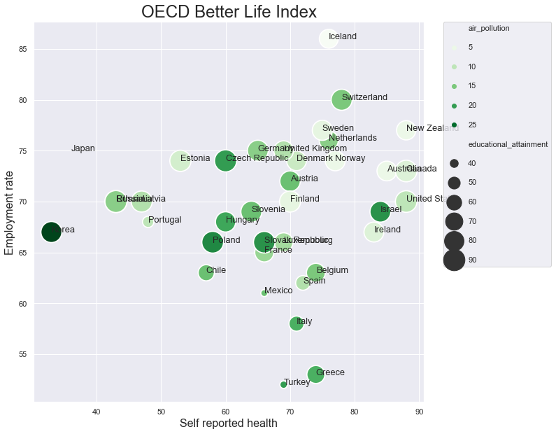
Conveying information via sizes and colours#
As we saw earlier, the hue parameter can be used to visualise the values of a categorical variable through the use of colour. This hue parameter can be used in a scatterplot as well. When you associate the hue with a categorical variable, the colours of the points in the scatter plot will indicate the categories they belong to.
Secondly, you can also specify that the sizes of the points should vary along with the values in a specific column. You can do this by supplying the name of this column as the value of the size parameter.
When the actual values in the column that you associate with the size parameter are too small or too big, you can rescale these values using the sizes parameter. This parameter demands two values: a minimum size and a maximum size. The values of the column that is mentioned in size will then be rescaled, on the range that is determined by these minimum and maximum values.
When the hue and/or the size parameter is used in the scatterplot() method, seaborn will add a legend automatically.
x_axis = 'self-reported_health'
y_axis =  'employment_rate'
point_size =  'educational_attainment'
point_colour = 'air_pollution'

df = df.dropna(subset = [x_axis, y_axis])

fig = plt.figure( figsize = ( 10,10 ))


## This line adds spacing in between the lines of the legend
sns.set(rc = {'legend.labelspacing': 1.6})

ax = sns.scatterplot( data=df, x=x_axis, y=y_axis,
                     hue= point_colour, size= point_size, sizes=( 100 , 1000) ,
                         palette="Greens" )

for index, row in df.iterrows():
    plt.text( row[x_axis], row[y_axis] , row['country'] , fontsize=12.8)


ax.set_xlabel( 'Self reported health'  , fontsize = 16 )
ax.set_ylabel( 'Employment rate'  , fontsize = 16 )
ax.set_title( 'OECD Better Life Index' , fontsize=24 )


# this next line places the legend outside of the graph
plt.legend(bbox_to_anchor=(1.05, 1), loc=2, borderaxespad=0.);

plt.savefig( 'scatterplot.png' , dpi=300 )
Saving an image#
To save the image that is created, you can work with the savefig() method. Within the parentheses, you should firstly supply a filename for the image. You can optionally provide the dpi method as well. This parameters specific the number of dots per inch.
Next to opening the graph in a viewer on your screen, using show(), it is also possible to instruct Python to create an image file on your computer, via the savefig() method. As the first parameter to this function, you must provide a filename. The filename must include an extension, such as ‘jpeg’, ‘tiff’, ‘png’ or ‘pdf’. The methods savefig() and show() are mutually exclusive. When you use one of these, you cannot use the other.
plt.savefig( 'scatterplot.png' , dpi=300 )
<Figure size 432x288 with 0 Axes>
Exercise 12.5.#
Add a new column to the df_2018 dataframe which you created for the previous exercises, containing the avrage values for reading and mathematics. You can use the code below for this purpose.
df_2018['pisa_mean'] = df_2018[['pisa_read', 'pisa_math']].mean(axis=1)
Next, adjust the scatterplot that you created for exercise 12.5 in two ways.
The sizes of the points should reflect the values in this newly created columns named ‘pisa_mean’. The sizes should range from 50 to 300.
The colours of the points should provide information about the continents.
Save the figure as a file named ‘scatterplot.png’. The resolution should be 300 dpi.
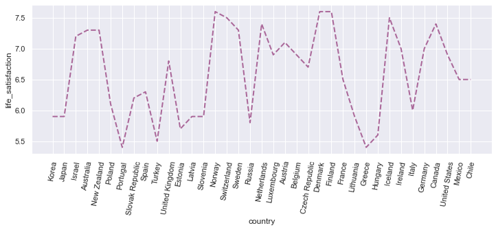
A line plot#
With seaborn, we can also create many other types of visualisations. To create a line plot, for example, you can use the lineplot() method. The line plot can be customised via the following parameters:
color: the color of the linelinewidth: Expectedly, the width of the linelinestyle: Options include:‘–’
‘.-’
‘:’
‘dotted’
‘dashed’
‘solid’
y_axis ="life_satisfaction"
df_sorted = df.sort_values(by=[ 'continent'] , ascending = True)


fig = plt.figure( figsize = ( 12, 4))
ax = sns.lineplot(data=df_sorted, x="country", y="life_satisfaction",
                  color= '#AA6799', linestyle='dashed',linewidth=2 )
plt.xticks(rotation= 80)
plt.show()
Exercise 12.6.#
Starting from the full PISA data set, creates a new dataframe containing the scores obtained by pupils in the Netherlands during the period in between 2004 and 2018.
Use this new dataframe to trace the development of the reading scores in the Netherlands in between 2000 and 2018. Focus on the total scores.
Ecercise 12.7.#
How did the scores for maths develop in the Netherlands in between 2000 and 2018? Focus on the score for boys and for girls separately.
Tip: You can also work with the hue parameter in thae case of line charts.
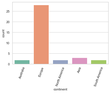
A count plot#
You can see that, using seaborn, you can create fairly advanced plots with only a few lines of code. If you want to see the number of items for each of the categories in a categorical variable, you can work with the countplot() method.
The code below indicates that the OECD dataset mostly concentrates on countries in Europe.
sns.set_style("whitegrid")
ax = sns.countplot(data= df, x="continent", palette='Set2')
plt.xticks(rotation= 70)
plt.show()
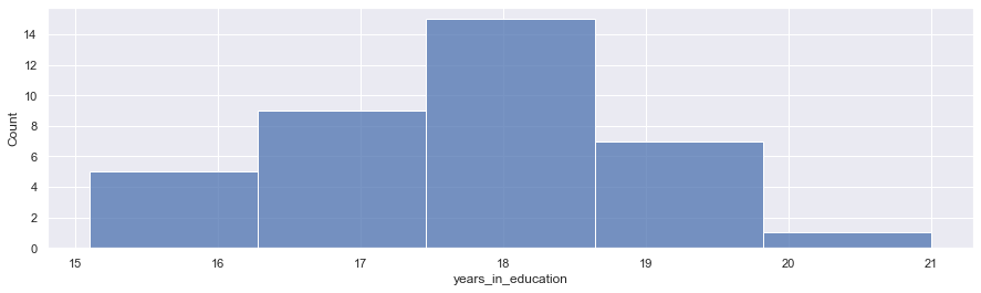
A histogram#
A countplot can be used to clarify the distribution across the options that are available for a categorical varable.
To explore the distibution of the values of a quantitative variable, you can work with a histogram. You can create such a histogram with histplot(). To generate such a plot, seaborn divives the available values evenly in a number of ranges and then counts the number of observations belonging to each of these groups. You can also specify the number of groups to be craeted explicitly using the bins parameter.
sns.set_style("darkgrid")
plt.figure( figsize = (15,4) )
graph = sns.histplot(data=df, x="years_in_education", bins = 5)
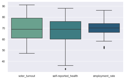
A boxplot#
A boxplot is a diagram which visualises the minimum, the maximum, the median and the first and third quartiles. It can be created using the boxplot() method.
fig = plt.figure( figsize = ( 8, 5))

columns = ['voter_turnout','self-reported_health','employment_rate']

graph = sns.boxplot(data=df[ columns ] , palette = 'crest' )
Exercise 12.8#
Have the scores remained relatively stable over the years if we look at the total scores? Or has there been some variation? How does the variation of the scores for the Netherlands compare to the scores in France, Germany, Belgium and Luxembourg? Try to answer this question by crearing a boxplot.
The names of the countries should be displayed on the X-axis, and the values associated with these countries should be displayed along the Y-axis.
For this exercise, it can be useful to make a list containing the countries you are interesed in, and to filter the dataframe using the isin() function.
countries = [ 'Netherlands', 'France' , 'Germany' , 'Belgium', 'Luxembourg']
df_countries = df[ df['location_name'].isin(countries) ]
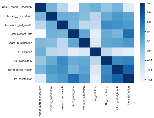
A heatmap#
Heatmaps often offer a useful way of visualising correlations in a dataset. Such correlations can be calculated using the corr() method from pandas.
In seaborn, such a heatmap clarifying the correlations among the variables in the data set can be created using only a few lines of code. The method to be used is named heatmap(). This method demands a two-dimensional matrix containing the values to be shown. The colours can be specified using the cmap parameter. As values, you can use the colour palettes that are predefined by seaborn.
columns = ['labour_market_insecurity',
           'housing_expenditure',
           'household_net_wealth',
       'employment_rate',
           'years_in_education', 'air_pollution',
        'life_expectancy',
       'self-reported_health', 'life_satisfaction']

plt.figure(figsize=(9,6))
## Correlations can be calculated using pandas' corr()
correlations = df[columns].corr()

# Heatmap
ax = sns.heatmap(correlations, cmap = 'Blues')
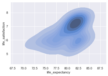
Density plot#
Density regions can be shown using kdeplot().
graph = sns.kdeplot( data = df , x= 'life_expectancy' ,
                    y = 'life_satisfaction' , shade=True )
Many other types are diagrams can be created. For more information, visit the gallery or the tutorials on the seaborn website.
Exercise 12.9#
The data folder of this tutorial includes a CSV file named ‘nobel.csv’. If necessary you can also download this file from the following address: https://edu.nl/3xmbd.
Visualise the data in this data set in the following ways.
Create a linechart in Seaborn to visualize the number of Nobel laureates per year. Can we find support for the claim that people increasingly need to share their Nobel Prizes with colleagues?
What are the nationalities of the Nobel laureates in the data set? Try to generate a bar plot which displays the various countries on the x-axis and the number of Nobel Prize winners produced by these countries on the y-axis. Limit your analysis to the countries listed in
countriesbelow.
    countries = ['Netherlands', 'France', 'Switzerland', 'India', 'Sweden',
       'Norway', 'United Kingdom', 'Spain', 'Russia', 'Poland', 'Germany',
       'Italy', 'United States of America', 'Belgium', 'Australia',
       'Ireland', 'Canada', 'Argentina', 'Japan', 'China', 'Brazil',
       'Bulgaria']
Examine the relation between the age of the Nobel laureate and year in which the prize was awarded. Do winners get younger, on average? Limit your analysis to the Prizes awarded in Chemistry and to laureates born after 1930. To answer this and the next question, you may reuse code developed for exercise 11.1.
Create a boxplot to visualise the age distribution per category.
import requests
import pandas as pd
import matplotlib.pyplot as plt
import seaborn as sns

path_to_csv = os.path.join('Data','nobel.csv')
# extract the year of birth from the birth date
df['Birth Year'] = pd.to_datetime(df['Birth Date']).dt.year

# calculate age by subtracting birth year from year of nobel prize
df['Age'] = df['Year'] - df['Birth Year']

## group by year
laureates_per_year = df.groupby('Year')['Laureate ID'].count()

## convert the result of 'group by' to dataframe
lpg_df = laureates_per_year.to_frame()
lpg_df = lpg_df.reset_index()
columns = ['Year','Number']
lpg_df.columns = columns


countries = ['Netherlands', 'France', 'Switzerland', 'India', 'Sweden',
       'Norway', 'United Kingdom', 'Spain', 'Russia', 'Poland', 'Germany',
       'Italy', 'United States of America', 'Belgium', 'Australia',
       'Ireland', 'Canada', 'Argentina', 'Japan', 'China', 'Brazil',
       'Bulgaria']

df_countries = df[ df['Birth Country'].isin(countries) ]

# group by countries
laureates_per_country = df_countries.groupby('Birth Country')['Laureate ID'].count()
lpg_df = laureates_per_country.to_frame()

# Rename the columns
lpg_df = lpg_df.reset_index()
columns = ['Country','Number']
lpg_df.columns = columns

# Sort countries by number of laureates
lpg_df = lpg_df.sort_values(by=['Number'] , ascending = False)
Exercise 12.10.#
In exercise 11.3, you created a CSV file named ‘prices_of_coffee_over_time.csv’, containing data about the average price of a pound of coffee on a range of dates. Use this CSV file to create a line chart which visualises the development of these prices over time.